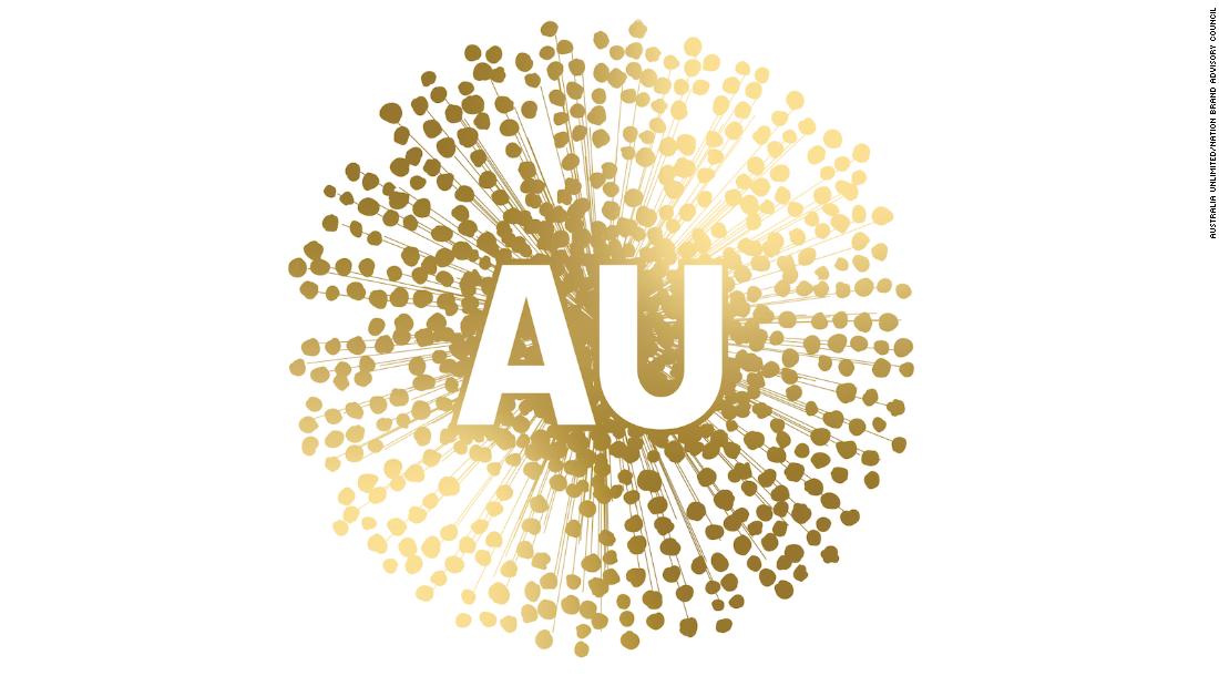
Australia's national flower, the golden wattle, has long appeared on stamps, emblems and awards, and is considered a symbol of unity in the country.
But its use in a new logo promoting Australia's interests overseas has proven divisive, with some even likening the design to depictions of the coronavirus.
The controversial logo, which its designers say was partly inspired by Aboriginal art and culture, was suggested by the Nation Brand Advisory Council and approved by Australia's trade minister, Simon Birmingham. And while the council's proposal was submitted back in December 2019 -- long before Covid-19 was classified as a global pandemic -- social media users were quick to draw comparisons.
The Nation Brand Advisory Council, which comprises figures from across business, media and the arts, nonetheless questioned the effectiveness of a kangaroo logo in its rebranding proposal, asking whether the animal would "shift perceptions of our nation, or simply reinforce what people already knew about us."
Conversely, the report said, the golden wattle symbol "provides a blank canvas, to tell a new Australian story."
Historic significance
Despite proving unpopular online, the golden wattle logo was intended to symbolize the flower's historic importance to both indigenous and non-indigenous Australians. According to the Nation Brand Advisory Council's proposal, the dotted design was inspired by Aboriginal art and was created in partnership with an indigenous design firm.
"The wattle has a long held significance for those that walk our land," read the council's proposal, which also outlines a new color palette and typeface for Australia's so-called Nation Brand. "In Indigenous tradition the blooming of the wattle denotes that the bush has come alive with growth. Each dot represents individuals and the coming together of diversity. The animals are plentiful and the fish are full and fat.
"The hearty resilience of the wattle has come to represent the enduring spirit of the Australian people," it added.
The council's report said that market testing had indicated a positive response to the new branding, with approval rating of over 70% among respondents. "Appeal for the wattle logo is strong," it claims.
Some on social media were more supportive of the idea. MasterChef Australia winner Adam Liaw took to Twitter to defend the thinking behind the design.
Australia Unlimited, the Nation Brand Advisory Council and the trade minister's office have not yet responded to CNN's request for comment.
"trade" - Google News
July 02, 2020 at 03:55PM
https://ift.tt/3iu1jF5
'It looks like a virus': Australia's new trade logo proves controversial - CNN
"trade" - Google News
https://ift.tt/2VQiPtJ
Tidak ada komentar:
Posting Komentar